WPF TabControl is used for grouping multiple items that share the same space.
TabControl consists of multiple TabItem controls. One one TabItem is visible at one time.
A TabItem has two areas.
- Header
- Content
Header is an area for specifying the header of TabItem. All Tab Items headers are always visible.
Content is an area for specifying the child controls of TabItem. Only one content area is visible at one time.
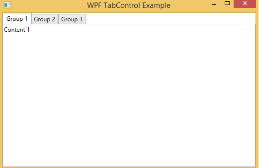
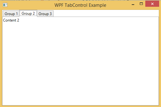
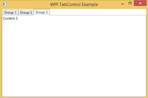
Below is the basic example of TabControl:
<TabControl>
	<TabItem Header="Group 1">
		<TextBlock Text="Content 1" />
	</TabItem>
	<TabItem Header="Group 2">
		<TextBlock Text="Content 2" />
	</TabItem>
	<TabItem Header="Group 3">
		<TextBlock Text="Content 3" />
	</TabItem>
</TabControl>
In the above code, I have defined three Tab Items. “Group 1”, “Group 2”, and “Group 3” are the headers of Tab Items.
A Tab Item specify only one Content Control. In the above code, I have added one TextBlock control in every Tab Item which is only visible when their associated Tab Header is selected.