Label control is used for showing the text data in the WPF application. It also provides support for Access Keys.
<Label />Content Property
Label is directly inherit from ContentControl class which provides the Content property to Label control.
In the Content property, you can set the string or host any type of child control.
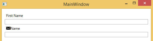
<StackPanel Margin="10">
	<Label Content="First Name" />
	<TextBox x:Name="txtFirstName" />

	<Label>
		<StackPanel Orientation="Horizontal">
			<Image Source="email.png" Height="15" Width="15" />
			<TextBlock Text="Name" />
		</StackPanel>
	</Label>
	<TextBox />
</StackPanel>
In the above example, I have set “First Name” as Content in the Label.
When you want to set any child control as Content to Label, whatever control you place between the starting and end brackets <Label>###</Label> is automatically set in Content property of Label.
In the 6th line of above example, I have set the StackPanel as child control and StackPanel are also contains two child controls Image and TextBlock.
Target Property
Target property of Label is used for setting the associated Control of Label which receives focus when user press the Access Key. I’ll explain AccessKey in below section.
Target property is set by the Binding Markup Extension and setting the ElementName property of Binding. ElementName takes the name of the control.
Below is the example of Target property.
<Label Content="_Name" Target="{Binding ElementName=txtName}" />
<TextBox Name="txtName" />
AccessKeys
Access keys are keyboard shortcuts to directly send focus on a control by pressing the combination of Alt + AccesssKey.
Below is the example:
<StackPanel>
        <Label Content="_Name" Target="{Binding ElementName=txtName}" />
        <TextBox Name="txtName" />

        <Label Content="A_ge" Target="{Binding ElementName=txtAge}" />
        <TextBox Name="txtAge" />
</StackPanel>
Put the underscore before the front of a character that makes the text mnemonic and set the Target binding to associated control name.
In the above example, I have put “_” before the “N” in the Name text and “_” before the “g” in the Age Label.
When I press Alt + N, the txtName textbox control got focus and when I press the Alt + g the txtAge textbox control got focus.
Label Text Wrapping
WPF Label by default does not provide text wrapping feature. But you can use AccessText control as child control of Label for getting the benefits of TextWrapping feature.
<Label Width="70">
	<AccessText TextWrapping="Wrap" Text="Please provide your _First Name">
	</AccessText>
</Label>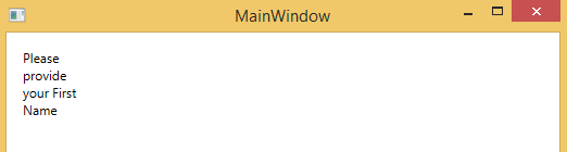
Change the TextColor
You can change the text color of Label by using the Foreground property. Below is the example:
<Label Foreground="Red" Content="Hello World" />

<Label Content="Hello USA">
	<Label.Foreground>
		<LinearGradientBrush StartPoint="0,1" EndPoint="1,0">
			<GradientStop Color="Red" Offset="0.1" />
			<GradientStop Color="Yellow" Offset="0.7" />
			<GradientStop Color="DarkBlue" Offset="0.9" />
		</LinearGradientBrush>
	</Label.Foreground>
</Label>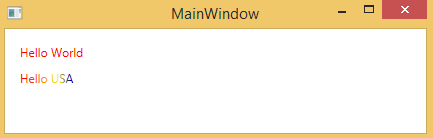
Label Background Property
Label background property is used for setting the back color of Label.
Below is the example:
<Label Content="Hello World" Background="Red" Foreground="Yellow" />You can also set Gradient color brush to background.
<Label Content="Hello World!!!" Margin="15" FontSize="28" Foreground="Yellow" Height="100">
	<Label.Background>
		<RadialGradientBrush Center="0.5,0.5">
			<GradientStop Offset="0.0" Color="Yellow" />
			<GradientStop Offset="1.0" Color="Red" />
		</RadialGradientBrush>
	</Label.Background>
</Label>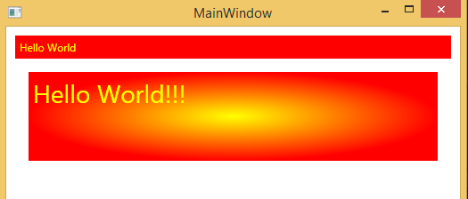
Background Image
Set the ImageBrush to Background property of Label and set the ImageSource property of ImageBrush to the source image like shown below:
<Label Content="Hello World!!!" Foreground="Green" Height="200" Padding="130,70,0,0" FontSize="40">
	<Label.Background>
		<ImageBrush ImageSource="nature-wallpaper.jpg" />
	</Label.Background>
</Label>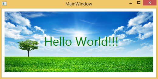
Text Alignment
Label provides 4 properties for setting the alignment.
- HorizontalAlignment
- VerticalAlignment
- HorizontalContentAlignment
- VerticalContentAlignment
HorizontalAlignment and VerticalAlignment set the horizontally or vertically position of the control within its parent control.
For example, if your parent control is 500px wide and your control is 100px wide and you want to set your control in the middle of parent control, then you set the HorizontalAlignment of control to Center.
VerticalAlignment: If your parent control has 100px height and your control has 100px height and you want to set your control in the bottom of parent control, then you set the VerticalAlignment of control to Bottom.
Possible values for HorizontalAlignment are:
- Center
- Left
- Right
- Stretch
Possible values for VerticalAlignment are:
- Bottom
- Center
- Stretch
- Top
<Grid Width="200" Height="200" Background="LemonChiffon">
	<Label Content="Hello" HorizontalAlignment="Right" VerticalAlignment="Bottom" />
</Grid>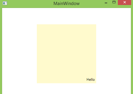
HorizontalContentAlignment and VerticalContentAlignment determines the control Content position within the control.
Possible values for HorizontalContentAlignment are:
- Center
- Left
- Right
- Stretch
Possible values for VerticalContentAlignment are:
- Bottom
- Center
- Stretch
- Top
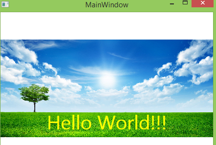
<Label Content="Hello World!!!" Foreground="Yellow" Height="200" FontSize="40" HorizontalContentAlignment="Center" VerticalContentAlignment="Bottom">
	<Label.Background>
		<ImageBrush ImageSource="nature-wallpaper.jpg" />
	</Label.Background>
</Label>
In the above example, I have set HorizontalContentAlignment to ‘Center’ and VerticalContentAlignment to ‘Bottom’. These settings change the Content position to the horizontally center and vertically bottom within the Label.
Difference between TextBlock and Label
TextBlock and Label are almost looks same but there are some major differences in them:
- TextBlock is used for multiline text but label is used for single line text.
- Label is directly inherit from ContentControl whereas TextBlock control inherits from FrameworkElement.
- TextBlock provides the Text property for display any data in string format but Label provides Content property for display any type of control as child.
- Label provides support for AccessKeys for directly send the focus on asscoiated control but TextBlock does not support AccessKeys.
- Label provides a Border control around its contents but TextBlock does not. Label has BorderBrush and BorderThickness properties for customizing the border properties.
- When you disable the Label, Label forground color has changed to Gray but TextBlock does not change foreground color when disabled.
- TextBlock provides support TextWrapping feature but Label does not.