WPF GridSplitter control gives user to resize the columns width and rows height. WPF Grid divides available space in rows and columns. When we define the RowDefinitions and ColumnDefinitions, we specify how much space a particular row or column should take. A user has no option to resize width and height later.
In the below example, I have divided the Grid into two columns and fixed the width of each column to 100. Suppose we are getting the data from the database, a first column data is coming big as not expected by us. Then some data will not be visible to user.
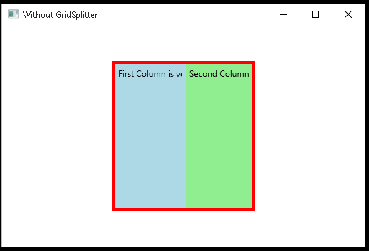
As in the above diagram, first column data is hidden from the user. User has no option to resize the width of first column to see the full data.
How to use GridSplitter
There are two ways to use WPF GridSplitter.
- Horizontal Splitter
- Vertical Splitter
Horizontal Splitter
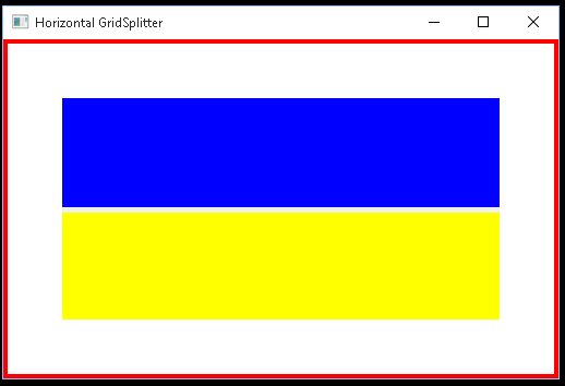
Horizontal Splitter gives user to resize rows height. For defining the GridSplitter, we must provide an extra row for splitter control between two rows. Row height for GridSplitter should be at least 5px.
For resizing the rows, we must set the splitter control HorizontalAlignment to Stretch. Below is the example.
<Grid Margin="50">
            <Grid.RowDefinitions>
                <RowDefinition Height="100" />
                <RowDefinition Height="5" />
                <RowDefinition Height="100" />
            </Grid.RowDefinitions>

            <Label Grid.Row="0" Background="Blue" HorizontalAlignment="Stretch" VerticalAlignment="Stretch" />
            <GridSplitter Grid.Row="1" HorizontalAlignment="Stretch" />
            <Label Grid.Row="2" Background="Yellow" HorizontalAlignment="Stretch" VerticalAlignment="Stretch" />
</Grid>
In the above code, we have define three rows. We have taken second row for GridSplitter control. We have set the HorizontalAlignment property to Stretch. When we hover over the second row, we get a special icon with two arraows to change the height of rows.
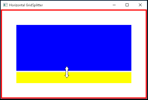
As shown in above diagrams, we can now change the height of each row by using splitter icon.
Vertical Splitter
Vertical GridSplitter allows you to change the width between two columns. For defining the splitter, we must define an extra column for GridSplitter control.
We also must set the HorizontalAlignment to Stretch of splitter control. Below is the example.
<Grid Margin="50" Width="205">
            <Grid.ColumnDefinitions>
                <ColumnDefinition Width="100" />
                <ColumnDefinition Width="5" />
                <ColumnDefinition Width="100" />
            </Grid.ColumnDefinitions>

            <Label Grid.Column="0" Background="Blue" HorizontalAlignment="Stretch" VerticalAlignment="Stretch" />
            <GridSplitter Grid.Column="1" HorizontalAlignment="Stretch" />
            <Label Grid.Column="2" Background="Yellow" HorizontalAlignment="Stretch" VerticalAlignment="Stretch" />
</Grid>
In the above code, we have defined second column for splitter control. In the GridSplitter control, we have set the HorizontalAlignment to Stretch.
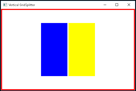
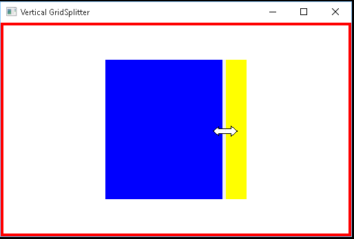
As shown in above diagrams, we can now change the column width by moving the splitter icon.
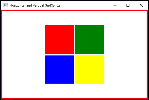
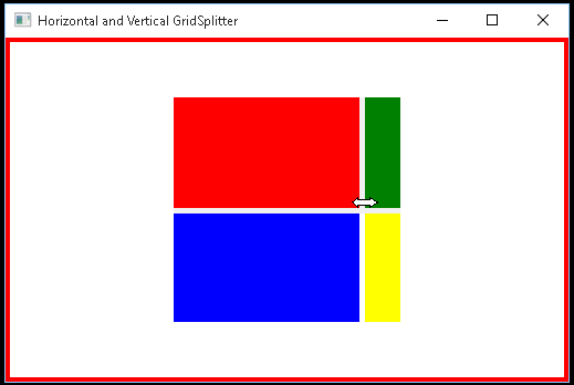
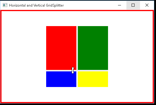
GridSplitter Full Example
In the above, we have taken two GridSplitter controls for changing the rows heights and columns widht in the same grid.
<Window x:Class="WpfApplication1.MainWindow"
        xmlns="http://schemas.microsoft.com/winfx/2006/xaml/presentation"
        xmlns:x="http://schemas.microsoft.com/winfx/2006/xaml"
        Title="Horizontal and Vertical GridSplitter" Height="350" Width="525">
    <Border BorderThickness="4" BorderBrush="Red">
        <Grid Margin="50" Width="205" Height="205">
            <Grid.RowDefinitions>
                <RowDefinition Height="100" />
                <RowDefinition Height="5" />
                <RowDefinition Height="100" />
            </Grid.RowDefinitions>

            <Grid.ColumnDefinitions>
                <ColumnDefinition Width="100" />
                <ColumnDefinition Width="5" />
                <ColumnDefinition Width="100" />
            </Grid.ColumnDefinitions>

            <Label x:Name="label1" Grid.Row="0"  Grid.Column="0" Background="Red" HorizontalAlignment="Stretch" VerticalAlignment="Stretch"></Label>
            <GridSplitter Grid.Column="1" Grid.RowSpan="3" HorizontalAlignment="Stretch" />
            <Label x:Name="label2" Grid.Row="0" Grid.Column="2" Background="Green" HorizontalAlignment="Stretch" VerticalAlignment="Stretch"></Label>

            <Label x:Name="label3" Grid.Row="2" Grid.Column="0" Background="Blue" HorizontalAlignment="Stretch" VerticalAlignment="Stretch"></Label>
            <GridSplitter Grid.Row="1" Grid.ColumnSpan="3" HorizontalAlignment="Stretch" />
            <Label x:Name="label4" Grid.Row="2" Grid.Column="2" Background="Yellow" HorizontalAlignment="Stretch" VerticalAlignment="Stretch" ></Label>
        </Grid>
    </Border>
</Window>
In the above code, we have taken two splitter controls and for both controls set HorizontalAlignment to Stretch. Below are the screenshots.
Final Words
GridSplitter is a very popular control for resizing the rows height and column widths. It gives the control the user to resize according to its own requirements. We can divide splitter control by horizontally and vertically.